
Figma Feature
Adding a component edit-in-place feature to a leading design tool
Overview
Figma is an influential and growing design product that is always pushing to make new and relevant features. One core feature is components, which is the focus of this project. The goal was to reduce friction when needing to edit a master component in the context of a final design, by adding a contextual edit-in-place feature.
Timeline
4 weeks
Role
UI/UX Design, Interaction Design

Discover
Researching the problem space and finding user needs
Research Goals
-
Is there a real need for this feature?
-
Do competitors have a component feature, and how does it work?
-
How do designers use and organize components in their workflow?
-
What pains and gains do designers have when using components?
-
What are the workarounds for these challenges?
-
Are there plugins for this, and how do they work?
Methods
-
Survey
-
Secondary research
-
Competitor analysis
-
User interviews
Survey
I used a survey to get an idea of what designers think and do regarding components, The goal was to get an overview snapshot of the core issues and see if my problem aligned with anything discovered.
Participants
-
Figma users
-
Any experience
Key Insights
-
Biggest gain from components is consistency
-
Biggest pains are overrides and variants
-
Beginners report fewer pain points than experienced designers
-
New designers keep components with the design file, and experienced use libraries
-
Detaching an instance from the master component is a common workaround
-
Beginners have low confidence and usage with components, and vice-versa for experienced
Secondary Research
I looked into plugins in the Figma community, and found a couple that came close to what I was looking for. I also looked at Figma documentation, and other articles. And I found an old forum post which addressed this exact issue.
Key Insights
-
Only one plugin truly matches this feature concept, but only for local components
-
There is expressed need for this type of feature in the community
-
Figma documentation makes no mention of edit-in-place
-
Most articles focus on design system organization and native techniques
Competitor Analysis
I checked out Figma's competition to see if they handled their systems of components in a different way, perhaps to gain some inspiration and see if this kind of feature would be unique and give an advantage.
In short, Figma is second behind Adobe XD regarding flexibility. All of them handle components similarly, and none of them have an edit-in-place feature.

User Interviews
I recruited a mix of beginner and experience designers. I sought to learn the pain points and see if they aligned with the feature hypothesis. The main thing I took from it was that there is a very wide spectrum of proficiency and interest with components, and it's not a function of experience.
Participants
-
Figma Users
-
All ages and gender
-
3 beginners
-
3 experienced
Interviews
-
All remote via Zoom
-
Recorded for analysis and notes
With all updates in products they always add new features, but it’s never about fixing old features.
How am I supposed to make changes as a separate element when I’m not looking at it within the entire page?
Overall everything is intuitive and no issues are major enough to need a feature.
I don’t know if I’m a nerd about components, like I see videos of people doing it...I’m not that.
I wish Figma would make learning easier.
Not everyone will be a Figma wizard and understand what they can or can’t do.
Affinity Diagram
Using the interview notes and recordings, I wrote out comments by participants and grouped them into an affinity diagram to identify common insights.

Research Insights
Based on all the research, I found the following themes.
Needs
-
Beginners acknowledge they need to learn more about components
-
Approaches to working and organizing components are very unique to the individual
-
Figma could do better with onboarding and clarifying limitations of their features
-
Competitors offer good solutions to specific needs that Figma could borrow
Pains
-
Users are afraid to make overrides or changes to components
-
People give up and do manual edits if using components isn't working
Define
Setting our goals and priorities to solve the problem
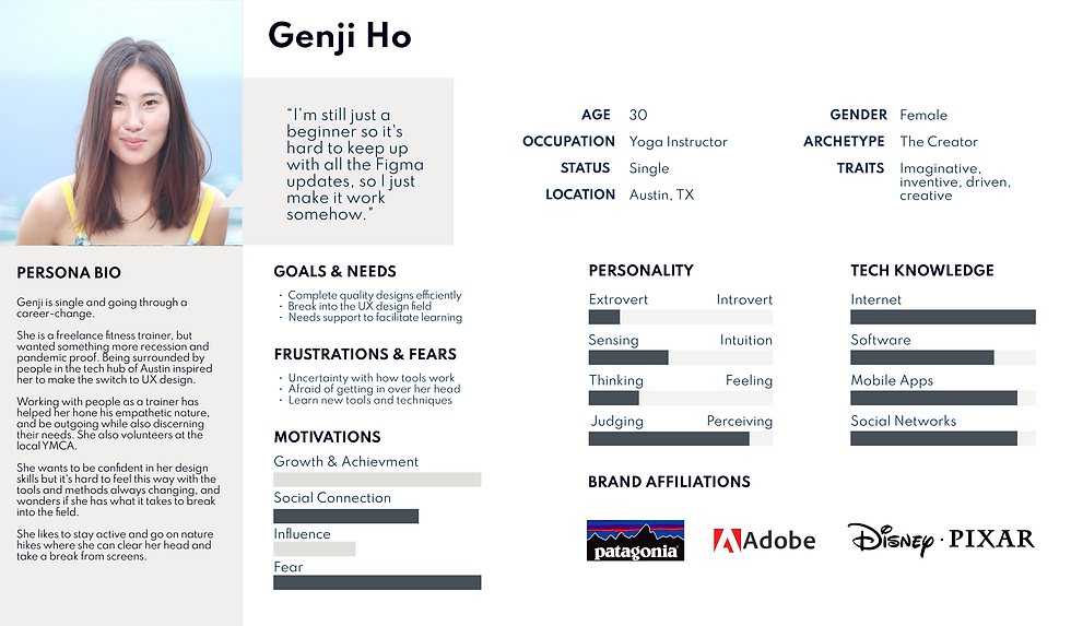
Personas
Using the insights from the affinity diagram and survey, I made two personas. One represents a beginner and the other represents an experienced designer. I wanted to keep both types of users in mind when designing.

Point of View & How Might We?
Using the persona insights and needs, the POV/HMW helped me to combine them into problem statements, and ask how the problem may be solved. I created user stories from the insights gained in research to guide this.
User Stories
As a designer, I want to:
-
Have component onboarding so that I understand how they work using the latest features and capabilities.
-
See how edits to a master component affect instances in the design as a whole, so that I know it looks right.
-
See a list of properties I can override, so I know whether or not I need to update a master component.

Design
Ideation and design of structure, user flows, wireframes, and UI elements
Golden Path
This exercise determined the critical path for the feature to base the design on, while other potential side-paths were acknowledged, based on research insights.

Sketches
I began by doing rough and quick sketches for screen design ideation, which were sketched again in more detail for better reference when making the wireframes.

Rough sketch

Detailed sketch

Detailed sketch
Rough sketch

User selects an instance and begins contextual edit.

Editor opens with master component selected.

Color picked and panel closes.
User selects an instance and begins contextual edit.

Nested component is in a shared library.

Second viewport opens to see edits in the hierarchy.

User publishes changes.
Nested component is in a shared library.


Methodology
-
Remote on Zoom & Figma
-
Moderated and recorded
-
Feedback questions
Usability Tests
I needed to see how intuitive the new UI elements and interactions were, and if they fit the look and feel of Figma. Research showed that this feature would be more geared towards mid to senior level designers, so I recruited from that group.
Participants
-
3 tests
-
Experienced designers
-
In-depth knowledge of Figma
It just has to be super clear that if the master does live in a design system file somewhere, and I go to master edit mode right here, and I save these changes, it’s gonna update in reverse to the design system.
If I go into a mode, it needs to be more obvious that I’m in a different mode.
I don’t need any other information from that file. I just need that component.
Key Takeaways
These are the main points taken from the usability tests.
-
Make it clear that you are in a new edit mode
-
Focus on the single component and not the entire design system
-
Make it clear how everything works with libraries
-
Make it clear what the instance level section does
-
Make viewport mode less like a frame and more like a window
-
Don’t forget about screen real estate
Priority Revisions
I aligned the revisions with the key takeaways from the usability test.
-
Added a canvas stroke and edit mode label when using the new feature
-
Removed the other design system components from the viewport
-
Added Figma publishing and reviewing modals when updating libraries
-
Made instance level clickable and show what is being edited and/or selected
-
Made viewport look more like a scalable window
-
Moved edit options out of the design panel and into a modal on canvas
-
Removed the fit to component and reset icons
-
Changed the check icon to a "Done" button

Example frame from prototype V1.

Example frame from prototype V2.
Example frame from prototype V1.
Final Prototype
After testing and prioritizing revisions, I updated the prototype and usability test script instructions.
Reflection
Thinking back on lessons learned and future plans
What I Learned
My personal frustrations that were the initial catalyst for this feature idea, so I wasn’t sure if it was viable until the research confirmed it is a problem that needs solving.
This project really fun, since I always like to optimize and improve upon processes, and because it was on Figma. I have a better idea about what feature work must be like. It’s an interesting mix of freedom and restriction.
The biggest challenge was designing Figma interactions and UI...in Figma! The content and the tool looked the same, so it took thinking and planning to cover the different states of the native UI.
I learned that users need clear visual communication about what they are doing in their tools, especially for a new feature that is introduced.
Next Steps
With more time, I would add more interactions overall to make it really feel like a Figma playground. I would also make a task flow for a complex component with many variants, and that instructed the user to navigate with the new Instance Level section.


